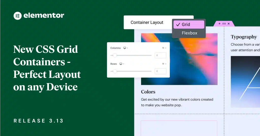
If you are a website developer or designer like me, you know how crucial it is to have a versatile and user-friendly page builder to create stunning websites. In my journey as a web professional, I have come across various tools, but none have impressed me as much as Elementor. Today, I want to share my experience with Elementor and delve into one of its most intriguing aspects: Elementor Container vs. Section. This comparison will highlight the differences, benefits, and best use cases of these two indispensable building blocks. So, let’s dive in!
Understanding Elementor Containers and Sections
Before we explore the comparison, let’s clarify what Elementor Containers and Sections are. Elementor, for those who might be new to it, is a powerful WordPress page builder that allows users to create visually captivating websites through a drag-and-drop interface. Containers and Sections are fundamental elements within Elementor that facilitate organizing and structuring your website’s layout.
Elementor Containers: A Container is a versatile element that holds other widgets and sections together. It acts as a wrapper for content, helping to group elements and apply a background style or color to the entire container. The container’s settings enable you to control the width, padding, and margin of the content within, offering precise layout control.
Elementor Sections: On the other hand, a Section serves as the backbone of your page, allowing you to divide your content into different segments. Each section can have multiple columns, and you can adjust the width, height, and background settings for individual sections. Sections are incredibly useful for creating visually appealing designs with various elements.

Comparison: Elementor Container vs. Section
- Design Flexibility: When it comes to design freedom, both Containers and Sections offer remarkable flexibility. However, Containers provide a more granular level of control. As a seasoned Elementor user, I find myself using Containers for intricate layouts, where I need different elements to align precisely. The ability to customize padding and margins for each Container makes it a winner for creating pixel-perfect designs.
- Background Options: While both Containers and Sections support background settings, they serve different purposes. Containers allow you to apply backgrounds to the content they hold, making it ideal for creating visually distinct blocks within a section. Sections, on the other hand, enable you to set a background for the entire segment, making it perfect for creating visually striking segments on your page.
- Nested Structures: Here’s a significant distinction between Containers and Sections: Containers can be nested within one another, while Sections cannot. This nesting ability of Containers grants me the freedom to create complex layouts with ease. When I need to arrange multiple elements within a specific section, I use Containers to achieve a well-structured and organized design.
- Responsiveness: Both Containers and Sections are fully responsive, ensuring that your website looks great on various devices. Elementor automatically adapts the layout based on the device, but it’s worth noting that improper nesting of Containers may sometimes affect responsiveness. Therefore, it’s essential to use nested Containers thoughtfully to maintain a consistent and seamless user experience across all devices.
- Best Use Cases: For straightforward designs or when I want to create sections with distinct background styles, I rely on Sections. They simplify the process of setting up visually striking segments, especially for landing pages or homepage hero sections. However, when the design calls for complex layouts with multiple elements aligned perfectly, Containers are my go-to solution.
Tags: Elementor, Web Design, Page Builder, Elementor Container vs. Section, WordPress.
Conclusion
In conclusion, Elementor has become an integral part of my web design toolkit, and its Container vs. Section comparison sheds light on the level of control and creativity it offers. The flexibility of Containers and the structure of Sections complement each other beautifully, empowering users like me to create exceptional websites without limitations.
If you’re a web designer or developer seeking unparalleled design control and efficiency, I highly recommend exploring Elementor. The Container vs. Section comparison is just the tip of the iceberg. So why not unleash your creativity and bring your vision to life with Elementor today?
To experience the power of Elementor firsthand, visit the official website: https://elementor.com. Happy designing!
